Article 1 of 4 · Page spec
- Primary keyword
- coastal home decorPlaced in the meta title, the H1, and the first 100 words below.
- URL
- harborandpine.example/journal/coastal-home-decor-guide
- Meta title
- Coastal Home Decor That Feels Collected | Harbor & Pine55/60 characters
- Meta description
- Skip the anchors and rope knots. A room by room guide to coastal home decor built on light, texture, and a quiet palette, from the Harbor & Pine team.150/155 characters
- Word count
- 1,599 wordstarget 1,500+Counted from the article as rendered on this page.
- Internal links
- washed linen throw→ /collections/washed-linen-throws
- jute and seagrass rugs→ /collections/natural-fiber-rugs
- our rug size guide→ /journal/rug-size-guide
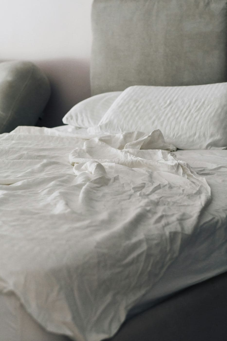
Harbor & Pine Journal
Photograph: Dina Makhmutova
Coastal Home Decor That Feels Collected, Not Themed
Type coastal home decor into a search bar and you will drown in rope mirrors, anchor pillows, and driftwood letters that spell BEACH. That version of the style is the reason so many people who genuinely love the coast hesitate to bring it indoors. It reads like a gift shop, not like a home.
The coastal rooms that actually feel good, the ones that get photographed for design magazines and handed down through families, almost never announce themselves. They work with light, texture, and a restrained palette instead of motifs. This guide walks through how to get that quieter version of the look, room by room, without buying a single decorative seashell.
Why the themed version falls flat
Themed decorating asks objects to do the work that materials should be doing. When a pillow has an anchor printed on it, the pillow is telling you about the beach. When a pillow is loomed from heavy flax linen in a faded oat color, the pillow is behaving like the beach: relaxed, sun washed, a little imperfect. The first approach is a caption. The second is an atmosphere.
There is also a saturation problem. A room can absorb one literal reference, maybe two, before it tips into novelty. A single piece of found coral on a stack of books reads as a memory. Coral on the lamp, the curtains, and the bath mat reads as a purchase order. If you are unsure whether something crosses the line, try this test: if the word beach were banned from the product description, would you still want the object? The things that survive that test are the things worth bringing home.
Start with light, because the coast is really about light
Ask people what they remember about a week at the shore and they rarely mention objects. They mention the quality of the light: bright, diffuse, bouncing off water and sand. That is the first thing to recreate, and it costs less than most furniture.
Paint matters most. Choose a warm white or a pale sand tone rather than a stark gallery white, which can turn cold and blue in northern rooms. Swap heavy drapes for sheer or unlined curtains that filter light instead of blocking it, and keep the sight lines to your windows clear of tall furniture. A well placed mirror opposite or adjacent to a window will roughly double the daylight a small room feels like it gets.
Finish choices carry the same logic. Matte and eggshell surfaces scatter light softly; high gloss creates hard glare that fights the relaxed mood. If a room still feels dim, add a second layer of low, warm lamps rather than one bright overhead source. Evening light at the coast is golden, not fluorescent.
Build the palette from sand, not navy
The instinct is to start with blue. Resist it. Rooms that lead with bright navy and white stripes date quickly and box you into nautical territory. The more durable coastal palettes start from the ground: sand, oat, bone, driftwood gray, and warm plaster tones. These neutrals do eighty percent of the work.
Blue then becomes an accent, and it works best either deep and inky or faded almost to gray, the way real seawater and real workwear actually look. Add a secondary natural green, something in the seagrass or sage family, and stop there. A simple ratio keeps the room disciplined: about eighty percent base neutrals, fifteen percent your muted blue or green, five percent a warm contrast like terracotta, brass, or aged leather.
One practical note on choosing paint: sample every candidate on two walls, one that faces the window and one that does not, and look at both in morning and evening light. Coastal palettes live and die by daylight, and a sand tone that glows at noon can turn muddy at dusk.
Let texture do the heavy lifting
If the palette is quiet, texture is what keeps the room from going flat. This is where the coastal look is really built: linen with visible slubs, jute and seagrass underfoot, rattan and cane furniture, unglazed ceramics, rope only when it is doing an actual job, and wood with enough grain and wear to prove it has a history.
The technique is contrast. Pair something smooth with something nubby in every zone of the room: a smooth plaster wall behind a chunky wool throw, a sleek oak table under rough woven placemats, crisp cotton cushions against a slubby washed linen throw. When two textures meet, both become more noticeable, and the room reads as layered even though the colors barely change.
Underfoot, natural fibers are the fastest single upgrade. Jute and seagrass rugs ground a pale room, hide sand and crumbs between cleanings, and get better looking as they wear in. Let patina happen. A faded rug edge or a water mark on a wooden tray is not damage in this style; it is evidence.
Room by room: the living room
Anchor the space with a sofa in a durable, forgiving neutral. Performance linen blends and heavy cottons in oat or fog gray hide daily life and give you decades of flexibility as accents change around them. Slipcovered styles suit the look especially well because they can be washed and because they sit a little relaxed rather than upholstered tight.
Size the rug generously; a rug that is too small is the most common mistake we see in customer photos, and our rug size guide covers the exact measurements for each layout. Front legs of every seat should land on the rug at minimum.
For walls, choose one large piece over a gallery of small ones: an oversized seascape photograph, a loose abstract in your palette, or a simple framed textile. Style the coffee table with ceramics, books, and one organic object, and skip the figurines entirely.
Room by room: the bedroom
Bedrooms take to this style faster than any other room because bedding is texture you sleep in. Washed linen or crinkled cotton in white, oat, or a faded botanical tone gives you the lived in, air dried look without effort; these fabrics are meant to skip the iron.
Hold the whole room to three colors. A pale wall, natural bedding, and one muted accent repeated exactly twice, say a sage lumbar pillow and a matching throw at the foot of the bed, is enough. More than that and the calm evaporates.
Light the room the way the coast lights an evening: two warm bedside lamps around 2700K rather than a bright ceiling fixture. Layer window treatments so you can have both moods, a sheer curtain for daytime glow and a discreet blackout roller behind it for actual sleep.
Room by room: kitchen and bath
In kitchens, the coastal move is openness and honest materials rather than color. A single open shelf holding everyday ceramics, glass storage jars, and a wooden board does more than any backsplash motif. Swap plastic accessories for wood, stone, and metal versions of the same objects, and hang flat woven cotton towels in faded tones you would find in your palette anyway.
Bathrooms follow the same rules at smaller scale: generous white or sand towels, a teak or oak bath mat or stool, an amber glass soap dispenser, and one plant that tolerates humidity. What to leave at the store: anything shell shaped, and any sign that tells guests which room they are standing in.
Both rooms benefit from one scent decision made deliberately. A single candle or diffuser in a coastal register, salt, fig, cedar, or clean linen, repeated in both rooms, ties the house together in a way guests notice but cannot name. Rotating a different fragrance into every room has the opposite effect.
What to skip, and the one exception
For clarity, here is the short blacklist that keeps a coastal room out of gift shop territory: rope wrapped vases and mirror frames, anchor and ship wheel motifs on anything, printed slogans about the beach or the lake, shell shaped dishes and soap holders, fishing net draped on walls, and matched sets of nautical accessories sold as a bundle.
The exception is the real thing. Objects with an actual history, a stone from a trip, a piece of driftwood you carried home, a faded photograph of a grandparent's boat, carry their own weight and belong in the room. One or two of them, placed where you will see them daily, will always beat a shelf of decor that depicts the same idea.
Buy slower, and let the room accumulate
The collected look in the title of this guide is not a shopping list; it is a pace. Rooms that feel layered were almost always assembled over seasons: a vintage bench found in spring, a lamp inherited in autumn, cushions swapped as old ones fade. Natural materials reward this patience because they improve with age, while themed decor only dates.
A practical sequence, if you want one: paint and window treatments first, because they change the light everything else will be judged in. The rug second, because it sets the palette from the floor up. Large textiles third, sofa cover, bedding, curtains, and only then the small objects, chosen one at a time as you find pieces you would keep even if you moved inland tomorrow.
So start with the bones this month: light, wall color, one natural fiber rug, and honest textiles on the largest surfaces. Then stop, live in it, and let the rest arrive slowly. The coast was never in a hurry either.